Example Perceptual Maps for Candy Bars
Below you will find two different example perceptual maps for Candy Bars.
Two variations of perceptual maps have been provided below (using different product and/or brand attributes), in order to give you a choice of the map that best suits your needs.
You should note that each mapping approach will “paint a different picture” of the market, which may help provide insight into the relative brand positioning strategies.
IMPORTANT NOTE: These example maps have been provided for educational purposes only and are estimates of brand positioning only, and should not be relied upon for decision-making. Perceptual maps used in marketing should always be based upon current and valid consumer image data.
Design Notes
Each of the example perceptual maps below have been created with the Excel perceptual map maker/template available for free download on Perceptual Maps 4 Marketing.
You can use this Excel perceptual map template in conjunction with the product/brand attribute ideas to design your own perceptual map (if required). Please refer to the list of tools and resources at the end of this post.
1st Example Perceptual Map for Candy Bars
Want to design your own map? Take me to the free download page: Free Download of the Perceptual Map Template
Perceptual Map Scores Rationale and Discussion
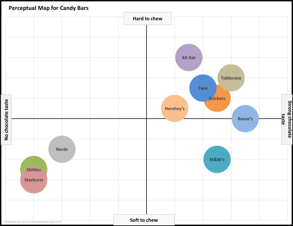
For the product/brand attributes of: No chocolate taste to Strong chocolate taste
– Snickers: 7.5 – Snickers has a strong chocolate taste, with peanuts and caramel also adding to the overall flavor profile.
– Reese’s: 8.5 – While Reese’s is primarily known for its peanut butter flavor, the chocolate in the cups is also a prominent taste that complements the peanut butter well.
– Kit Kat: 6.5 – While Kit Kats do contain chocolate, it is not the dominant flavor in the candy. The wafer layers provide a crispy texture and the chocolate is more subdued.
– Twix: 7.0 – Twix has a strong chocolate taste, but the cookie component also adds a distinct flavor and texture to the candy.
– Skittles: 1.0 – Skittles are fruit-flavored candies and do not contain any chocolate.
– Starburst: 1.0 – Like Skittles, Starburst are fruit-flavored and do not contain chocolate.
– Toblerone: 8.0 – Toblerone is a Swiss chocolate with a distinctive triangular shape. The chocolate is smooth and creamy with a rich cocoa flavor.
– Nerds: 2.0 – Nerds are small, crunchy candies with a fruity flavor and do not contain chocolate.
– Hershey’s: 6.0 – Hershey’s milk chocolate has a distinct flavor, but is not as rich or strong as other chocolate brands. The chocolate has a slightly sweet taste with a mild cocoa flavor.
– M&M’s: 7.5 – M&M’s have a milk chocolate center that is coated in a candy shell. The chocolate has a creamy and smooth texture with a sweet flavor.
Note: These are hypothetical ratings developed with the assistance of AI tools.
For the product/brand attributes of: Soft to chew to Hard to chew
– Snickers: 6.0 – Snickers has a chewy nougat and caramel center, but it is not as hard to chew as some other candies.
– Reese’s: 5.0 – Reese’s peanut butter cups have a soft and smooth texture that is easy to chew.
– Kit Kat: 8.0 – Kit Kats have a crispy wafer center that can be difficult to chew if not bitten into carefully.
– Twix: 6.5 – Twix has a similar texture to Snickers with a chewy caramel center, but is slightly easier to chew due to its cookie component.
– Skittles: 2.5 – Skittles have a chewy texture that is easy to bite through.
– Starburst: 2.0 – Starburst are chewy candies with a soft and pliable texture that is easy to chew.
– Toblerone: 7.0 – Toblerone has a hard and crunchy texture due to its triangular shape and the inclusion of chopped nuts.
– Nerds: 3.5 – Nerds have a hard and crunchy texture that can be difficult to chew if not sucked on or bitten carefully.
– Hershey’s: 5.5 – Hershey’s chocolate bars have a smooth and creamy texture that is easy to chew.
– M&M’s: 3.0 – M&M’s have a hard candy shell that can be difficult to chew through, but the chocolate center is soft and easy to bite into.
Note: These are hypothetical ratings developed with the assistance of AI tools.
2nd Example Perceptual Map for Candy Bars
Want to design your own map? Take me to the free download page: Free Download of the Perceptual Map Template
Perceptual Map Scores Rationale and Discussion
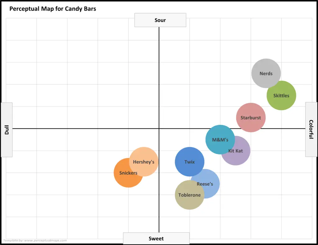
For the product/brand attributes of: Dull to Colorful
– Snickers: 4.0 – Snickers packaging is primarily brown with a simple logo, making it less visually appealing than other brands.
– Reese’s: 6.5 – Reese’s packaging features the brand’s signature orange color, which is eye-catching but not as colorful as some other brands.
– Kit Kat: 7.5 – Kit Kat packaging is predominantly red with a bold logo and imagery of the candy, making it visually appealing.
– Twix: 6.0 – Twix packaging is primarily gold with a simple logo, making it less visually appealing than some other brands.
– Skittles: 9.0 – Skittles packaging features a rainbow of colors and imagery of the candy, making it very visually appealing.
– Starburst: 8.0 – Starburst packaging features bright colors and imagery of the candy, making it visually appealing.
– Toblerone: 6.0 – Toblerone packaging is primarily gold with a simple logo, making it less visually appealing than some other brands.
– Nerds: 8.5 – Nerds packaging features a bright and colorful design with imagery of the candy, making it very visually appealing.
– Hershey’s: 4.5 – Hershey’s packaging is primarily brown with a simple logo, making it less visually appealing than some other brands.
– M&M’s: 7.0 – M&M’s packaging features the brand’s signature colors and imagery of the candy, making it visually appealing.
Note: These are hypothetical ratings developed with the assistance of AI tools.
For the product/brand attributes of: Sweet to Sour
– Snickers: 3.0 – Snickers is primarily a sweet candy with the caramel and nougat adding to the overall sweetness.
– Reese’s: 2.5 – Reese’s is a sweet candy with the peanut butter providing a slightly savory flavor.
– Kit Kat: 4.0 – Kit Kat is a moderately sweet candy with the wafer layers providing a slightly crispy texture and a mild sweetness.
– Twix: 3.5 – Twix is a sweet candy with the cookie component providing a slightly crunchy texture and a mild sweetness.
– Skittles: 6.5 – Skittles are a fruit-flavored candy that is known for its sourness, with the exception of the sweet flavors like strawberry and grape.
– Starburst: 5.5 – Starburst are a fruit-flavored candy that is also known for its sourness, although it is not as strong as Skittles.
– Toblerone: 2.0 – Toblerone is a sweet chocolate candy with no sourness.
– Nerds: 7.5 – Nerds are small, crunchy candies that are known for their sourness and come in a variety of fruit flavors.
– Hershey’s: 3.5 – Hershey’s milk chocolate has a mild sweetness with no sourness.
– M&M’s: 4.5 – M&M’s have a milk chocolate center that is coated in a candy shell, providing a moderate sweetness with no sourness.
Note: These are hypothetical ratings developed with the assistance of AI tools.
More Perceptual Mapping Information and Resources
Reasons to Use Perceptual Mapping
List of Product and Brand Attributes Ideas
Working with Perceptual Maps
- Perceptual Maps: Best Practice
- Get the Most Out of Your Perceptual Maps
- Top 12 Tips for Analyzing Perceptual Maps
Other Perceptual Mapping Tools
- Make 100s of Perceptual Maps Really Fast
- When to Use an Overall Similarities (OS) Perceptual Map
- What are Joint Space Maps?
- What is a Multi-Dimensional Scaling (MDS) Perceptual Map?
- How to Make a Perceptual Map in Excel 365
- How to make a perceptual map in PowerPoint
- Different Types of Perceptual Maps
Perceptual Maps 4 Marketing
- The Home of the Free Perceptual Map Excel Template
- Downloaded over 100,000 times since 2013
- Always free, always will be
- Ideal tool for marketing students, analysts, and practitioners
Take me to the free download page: Free Download of the Perceptual Map Template


